Users don't read, they feel.
How a dot reduced the time to magic.
- Mobile Editor
- Onboarding
- Interaction Design
The problem.
- What I found
- The bet
- The result
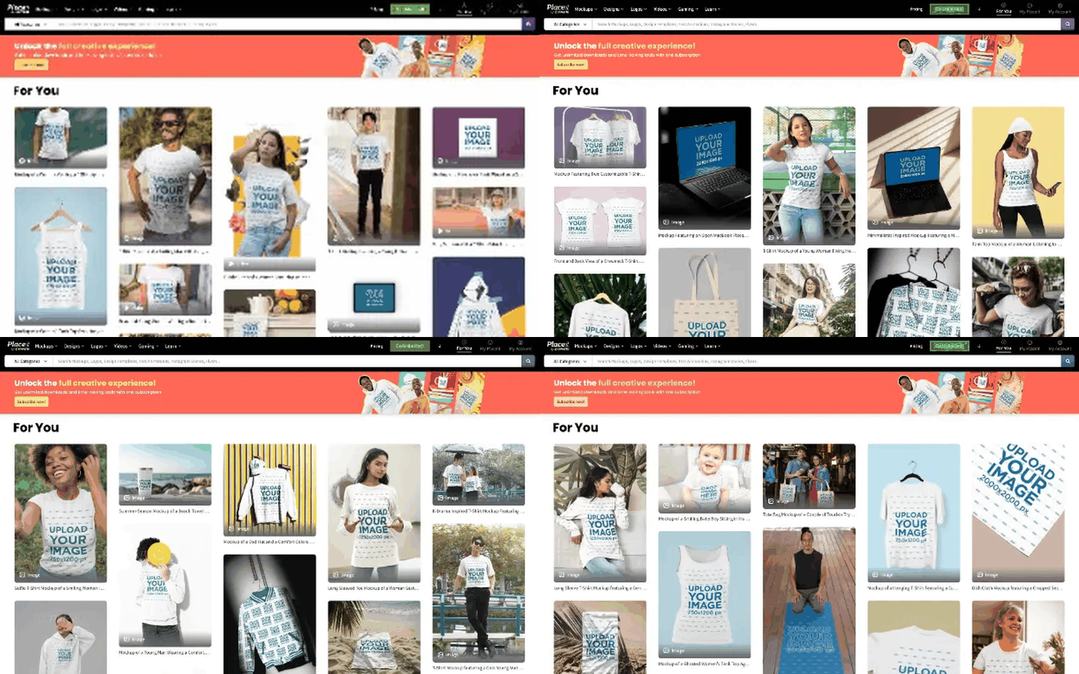
Placeit's mobile experience inherited desktop behavior wholesale, ignoring touch limits, screen size, and how people actually scroll on a phone. A lot of users opened a template and left without touching it once.
What I found.
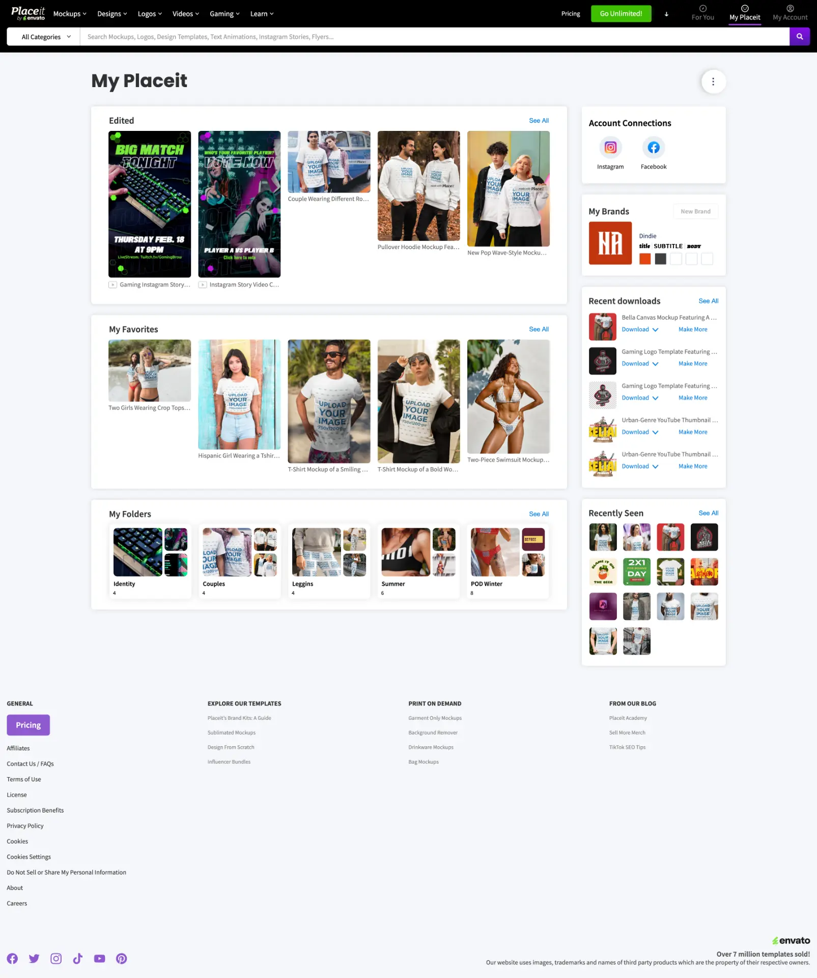
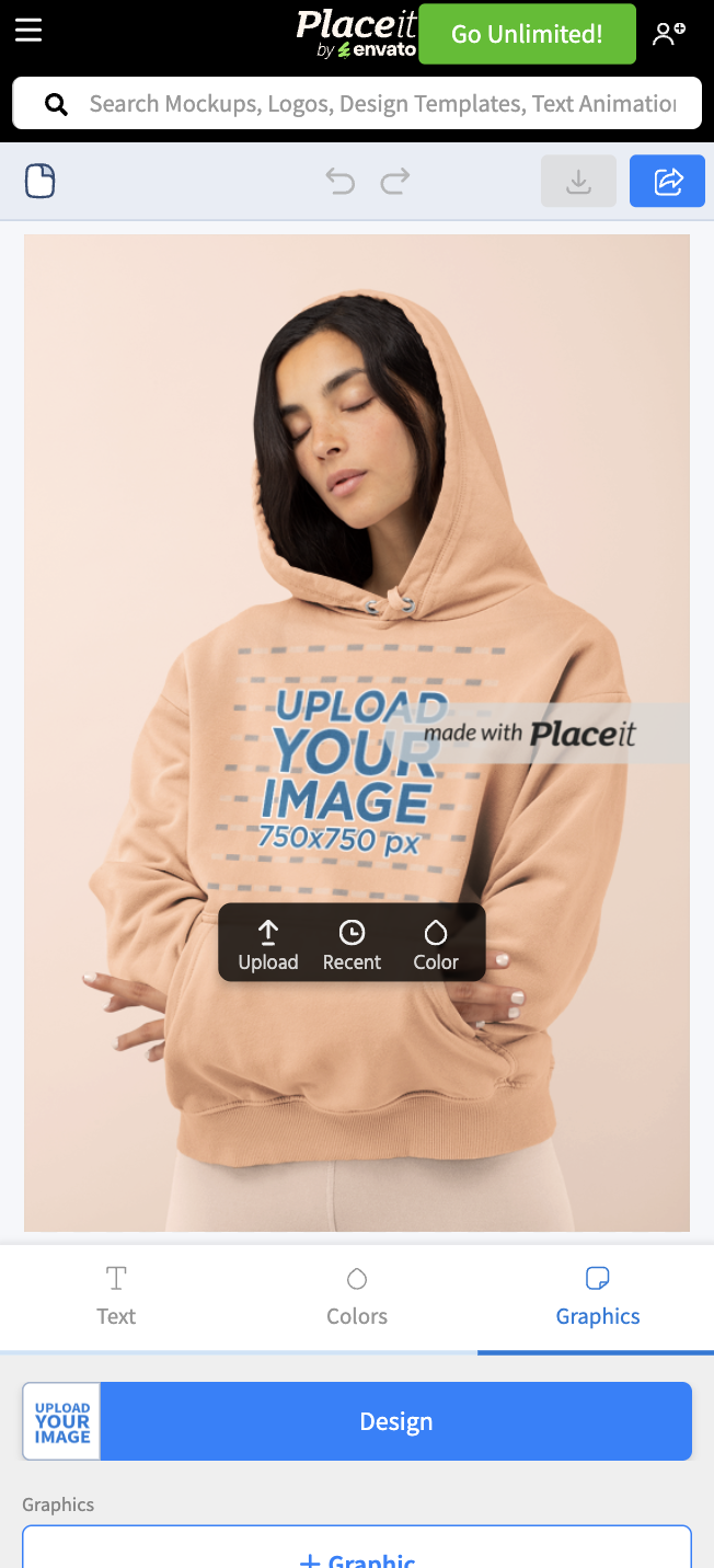
One specific thing was killing the funnel: people read the 'Upload your image' placeholder as an inactive label, not something you could tap. I watched a handful of session recordings before I believed it myself. That's the entire first moment of value, gone before it started.
The bet.
I rebuilt the interface to put the canvas front and center and redesigned the touch controls around it. For the placeholder, the fix was a basic affordance problem: a static box doesn't signal 'tap me.' I added a small dark dot that pulsed at the center of the placeholder text, then bloomed into a rounded tooltip reading 'Tap to edit' with a hand icon, before fading back and looping, so the eye landed exactly where the finger needed to go.
The result.
Time to Magic measured the time from opening a template to uploading an image and seeing it applied. With the animated indicator, it fell 40%. That number belongs to the indicator experiment, not to the broader editor redesign.
- 01Watch real session recordings of your onboarding, not just the funnel numbers.
- 02Here, a static placeholder read as decoration; motion is what made it read as an invitation.
 Placeit