The cheapest win ever.
How changing one button's color increased revenue.
- A/B Testing
- Conversion
- Navigation
The problem.
- What I found
- The bet
- The result
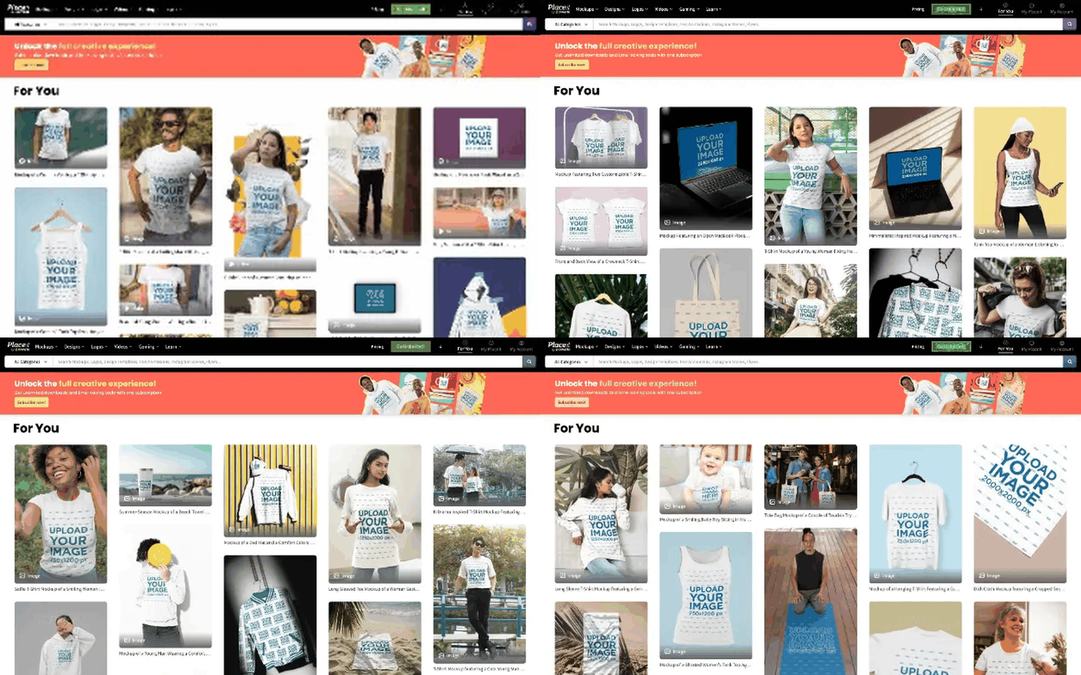
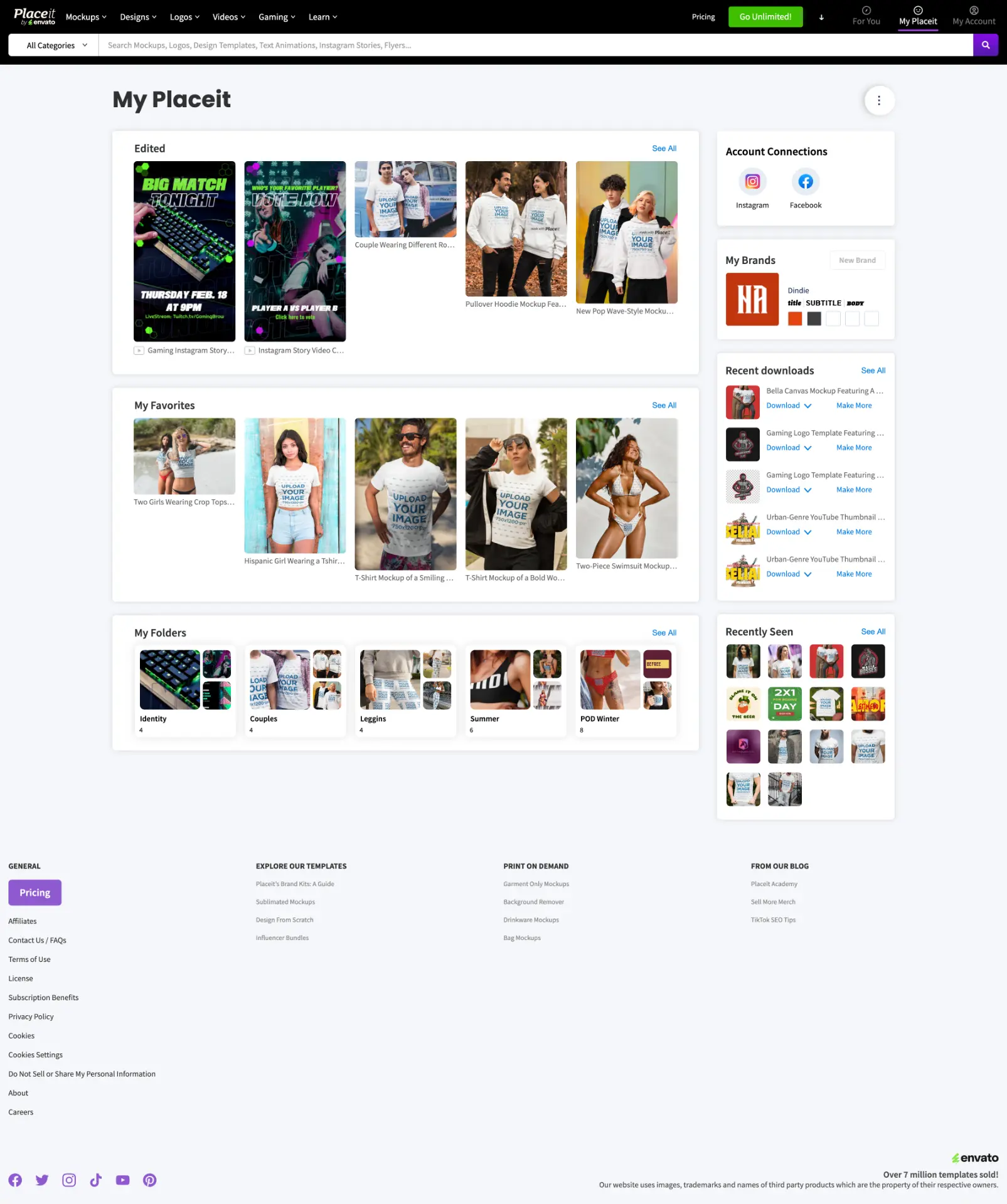
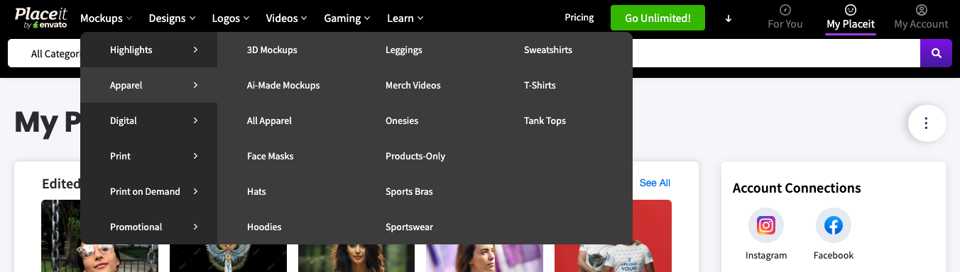
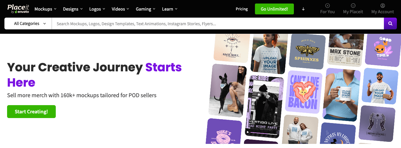
The main call to action lived in the navigation bar, visible on arrival at the homepage and present throughout browsing, and it was the same color as every secondary button. There was no visual hierarchy between the click that mattered most and everything else competing for attention.
What I found.
The color question was a hypothesis worth testing directly, not a redesign problem: does color alone change how many people click the button that matters. I liked this one specifically because it cost almost nothing to find out.
The bet.
I ran eight color variants of the CTA at the same time. Cheap, fast, no engineering overhead beyond the test itself. Green pulled ahead of every other variant by a clear margin, which wasn't the color I would have guessed going in.
The result.
Interaction with the CTA went up, the share of people who clicked and then bought held steady, and revenue increased. Green won out of eight variants.
- 01Before you redesign a whole page, ask whether the real problem is just visual hierarchy.
- 02Test more variants than feels necessary. The winning color is rarely the one anyone would have picked first.
 Placeit