Dindie.
Made to matter. Not to sell.
- Industrial design
- Platform
- Brand
- Venture
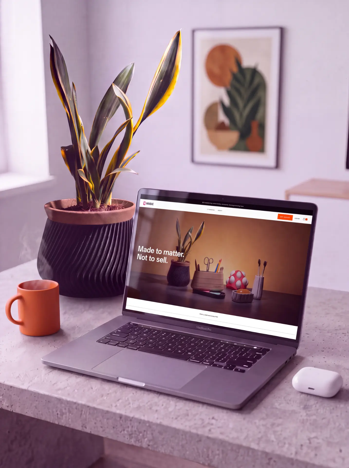
Permission to exist
Every category that went made to order handed authorship back to the person who made the thing.
Writers got there first. Once a single copy could be printed the day it was ordered, the print run stopped deciding which books existed, and the author kept the work. Apparel followed. Print the shirt when someone buys the shirt, and nobody has to guess how many to make.
Graphic designers have had it for years. They publish, they sell, they build a name on their own work, and the work stays theirs.
Product designers never got their turn.
An object still needs a factory, a mold, a minimum order in the thousands, and a buyer at a retail chain who signs off. Four gates, and none of them measure whether the object is any good.
So most product designers work anonymously. Inside the aesthetic of a brand that has money, which is not the same as having taste. Someone else's colors, someone else's forms, someone else's design cues. The ideas that were actually theirs stay on the drive, because they are expensive to make at scale and there is no version of the process where they survive.
There are designers who could make the world better with a single product and will never get to, because where they work they only make tubular chairs.
That is the thing I could not let stand.
What Dindie is
One is the new ten thousand.
A platform for objects made on demand.
A designer submits a piece. We review it. If it is resolved, it goes into production. When someone buys it, we make it, we pack it, we ship it, and the designer earns a royalty on every unit. No molds. No minimums. No warehouse. No money down.
The factory becomes a service, not a boss.
The name on the object is the designer's. Dindie is the label, not the star. A label that stands in front of its authors is just another brand absorbing them, and that is the problem, not the solution.
We accept very few. That is the point.
Today the published catalogue is still my own work, so the model can be proven on someone who cannot complain about it. Onboarding other designers is already under way: Rodrigo Covarrubias will be one of the first, and more are on the way.
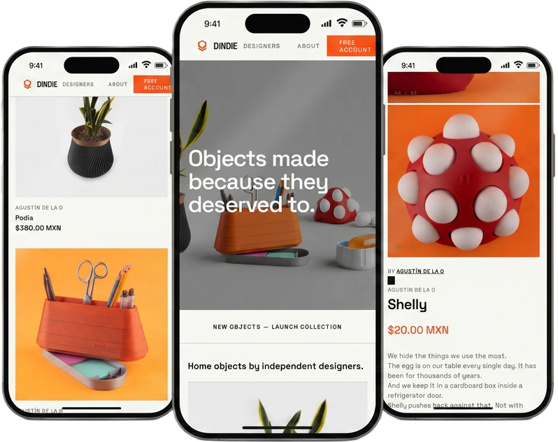
An object you download.
The whole graphic says it: utilization of digital files.
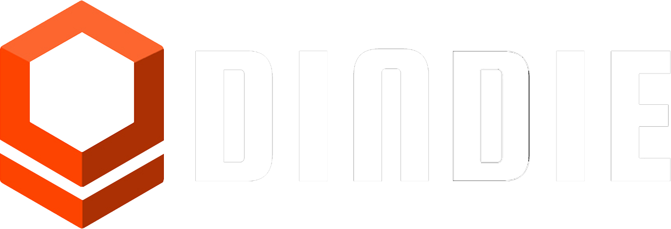
Dindie is indie design. The name says it: independent industrial designers.
The mark says the rest. A cube held in the negative space — an object that can be downloaded and produced anywhere, on any printer, in any place. That is what on-demand means made visible.
The line dropping from it is the download arrow. The little chevron that appears on a screen when a file is coming down. The whole graphic element tells you what the company does: utilization and exploitation of digital files. It is an object you download, because that is how we produce on-demand objects.
The mark is the business model, drawn once.
Three objects
The print chamber is not a limitation to design around. It is the brief.
Three pieces at launch. They share exactly one constraint: maximum size. The ceiling is the volume a 3D printer can print — the print chamber. Everything Dindie makes has to fit inside it, and the ceiling does not rise for a piece that wants to be bigger. It did not rise for mine.
That chamber volume is the module. Nothing else is specified. No colors, no forms, no design cues, nothing about what the object should be. One ceiling, and past it the piece belongs entirely to whoever designed it.
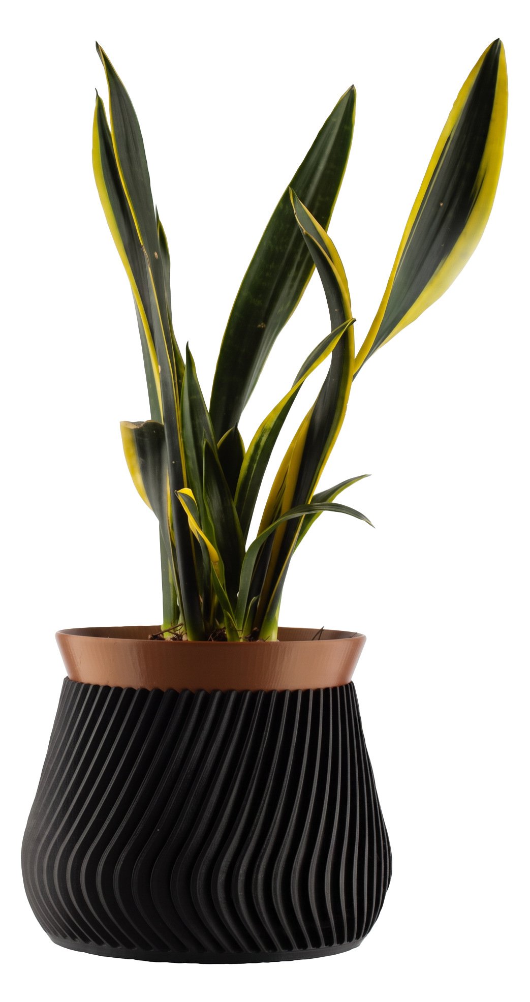
Podia.
Most planters solve holding the plant and defer what happens to the water, so you improvise with a kitchen plate that was never meant to be there. Podia inverts the hierarchy. The sculptural saucer lets water evaporate slowly between its ridges, and the container sits inside it, restrained, so it never competes.
Shelly.
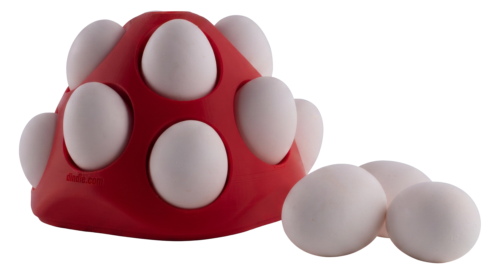
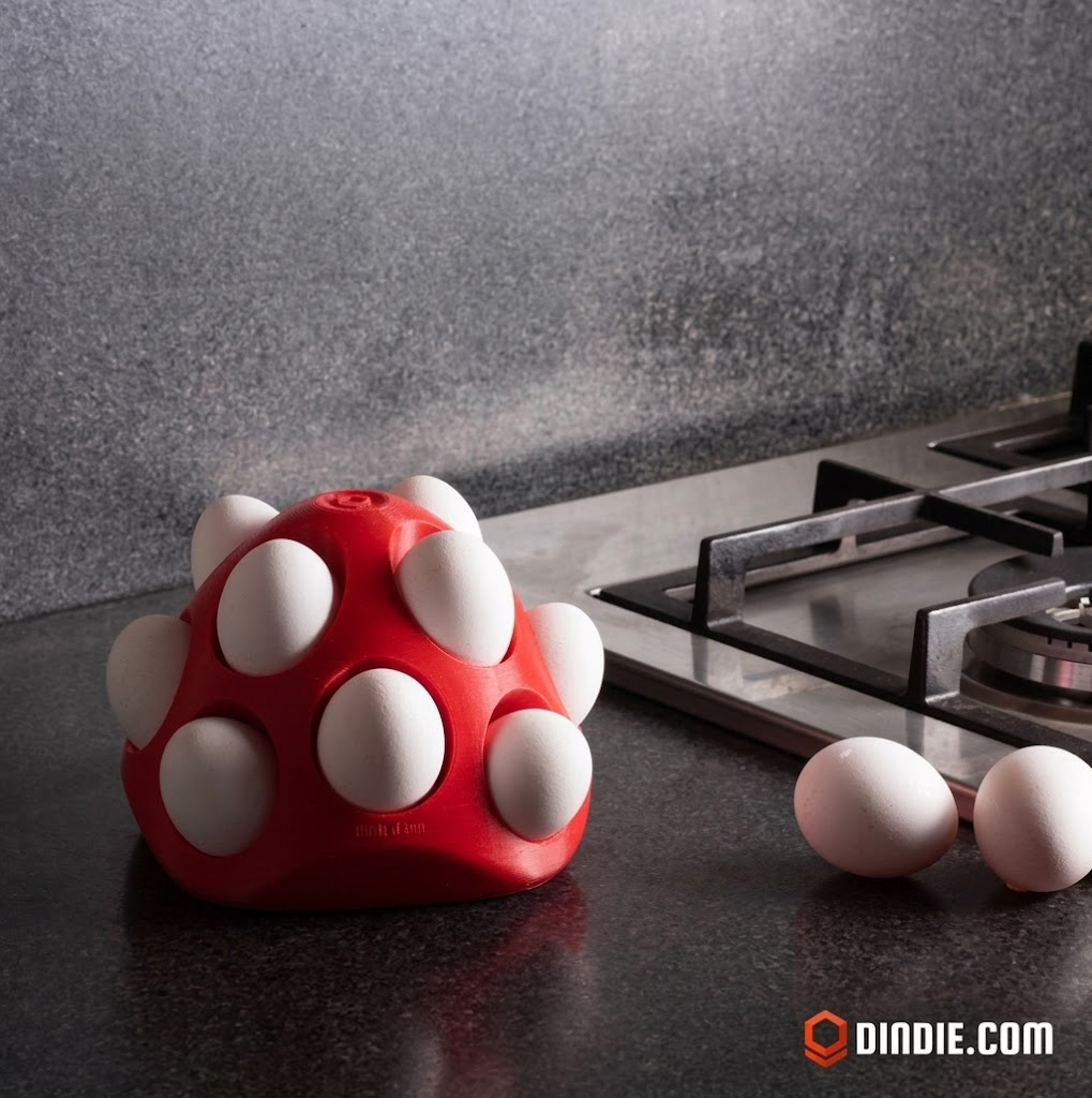
We hide the things we use most. The egg has been on the table for thousands of years and it lives in a cardboard box inside a refrigerator door. Shelly holds twelve in the open. The form changes every time you take one and renews every time you replace one. Never quite the same object twice.
Chromos.
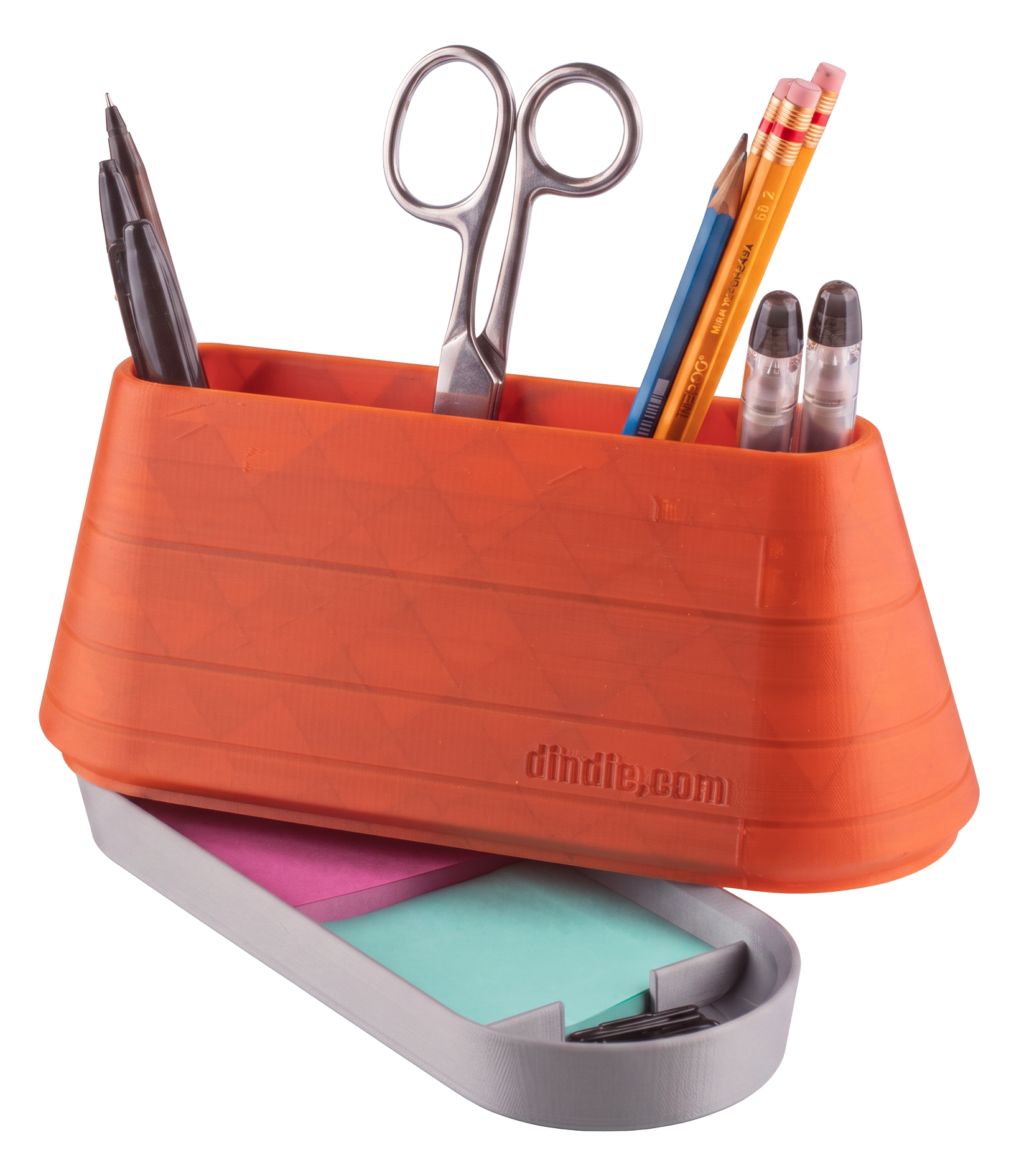
Two volumes. What you reach for stays visible. What supports it stays contained below, out of sight and still within reach. Good organization is not about storing more, it is about reaching what matters faster.
All three in PLA, a plant-based polymer.
One box, one bag, one screen
Minimum viable visible brand.
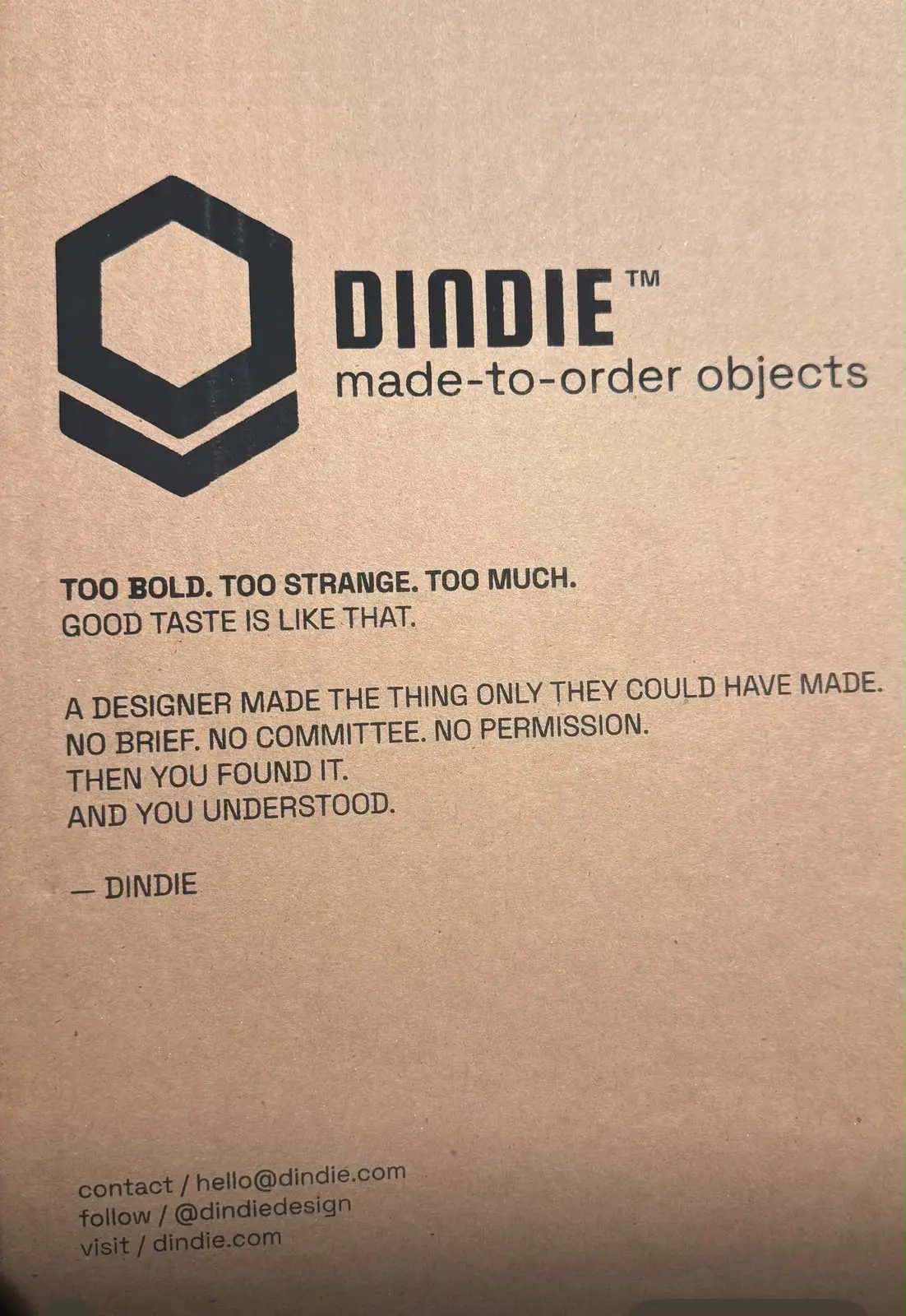
The format was an economics problem. Packaging is capital sitting in a room, and the constraint at launch was to spend the least possible and still arrive looking like a brand. So the system was designed backwards from that. One box, 30 × 30 × 30 cm, chosen to fit the largest single product; smaller objects can share it in certain combinations. One mailer, same logic, so the small objects float in it. One screen for the print, so the artwork was drawn to a single face and reused on everything. Tape carrying the mark on every face and nothing else, because the tape is the quiet layer.
The design work was not choosing between options. It was making the only option look like a decision.
The content was not. The printed surfaces are a sequence, and they get more personal the further in you go.
The box talks about the object. Too bold, too strange, too much. Good taste is like that. A designer made the thing only they could have made. No brief, no committee, no permission. It ends by handing the object over: then you found it, and you understood.
The mailer talks to the buyer. Every object in this package was made for you. No warehouses, no shelves, no leftovers. By designers, not committees.
The envelope talks as one person to another, and says only that: from the person behind this object.
Three layers, and each one closes the distance. By the time the letter reaches a hand, the packaging has already introduced whoever wrote it.
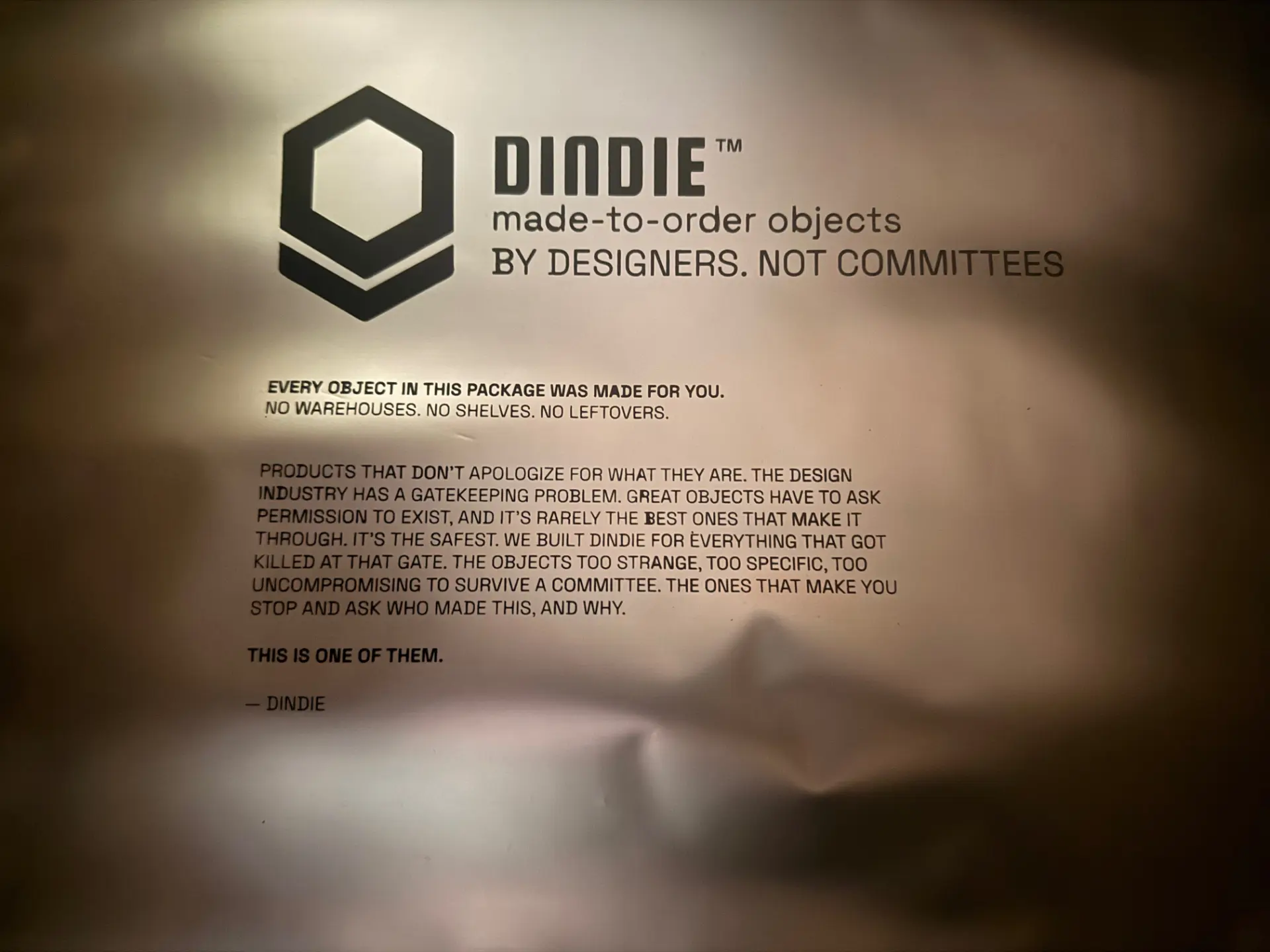
The letter
From the person behind this object.
- Three founders
- Why me
Every piece is designed to carry a numbered postcard. One side is a photograph of the designer with that exact piece, shot in their own space, not a studio. The other side is eighty to a hundred and twenty words they wrote themselves: who they are, why this piece, something for the person receiving it. Black and white.
Designed and specified. The letter and its envelope ship from the second production run.
Three founders.
One industrial designer, one operator, one technologist.
DindieTech S.A. de C.V. Based in Monterrey. We spent five years scaling digital products together at Envato before this.
I run design, brand and product. Patricia Narváez runs operations, brand and analytics. Eder Durán built the platform.
Two people crazy enough to believe in my vision.
We took it through Startup México's SUM Bootcamp. The useful part was not the pitch, it was being made to say out loud, over and over, what this actually is. Most of what we cut was infrastructure. What survived was the designers.
Why me.
The wall this company is trying to take down has me standing on both sides of it.
I am not the only person who could see this. I am in an unusually good position to build it.
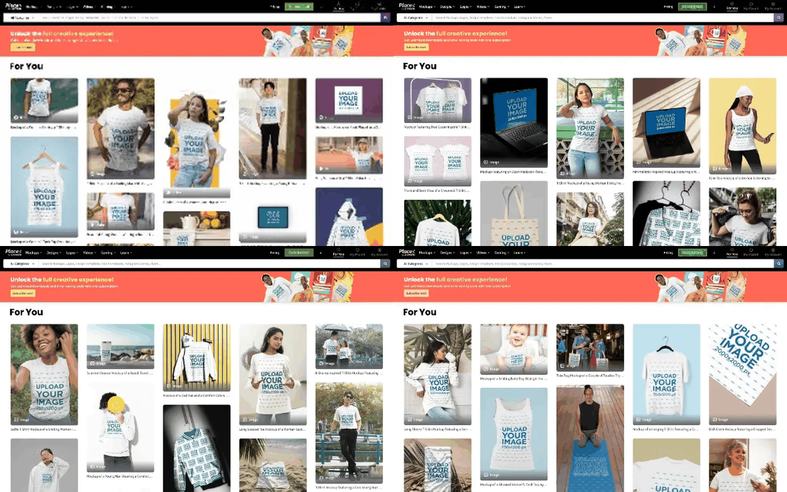
I trained as an industrial designer and then spent ten years building digital products at Envato, Placeit and OCC Mundial. I teach product design at Tecnológico de Monterrey, where every term I meet students whose work should already be for sale and is not.
And the idea picked me before I picked it. That is not a business argument. It is why it gets built anyway.
The bet
The objects are the evidence. The independence is the product.
Dindie is not a homeware brand. It is a bet that the next generation of product designers will not need a factory, a distributor or a retailer to make a living from their own work.
Free the designs. Free the designers.
Dindie