Image editors, fat fingers, and misunderstood intentions.
The thought process behind basic touch interactions.
- Mobile Editor
- Interaction Design
The problem.
- What I found
- The bet
- The result
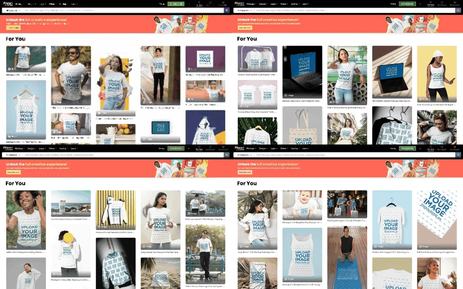
The design editor ran on an engine borrowed from the mockup editor, with no way to handle precise manipulation, which matters most on small screens where your own finger blocks the thing you're editing.
What I found.
The editor had never been built with a touch-first model in mind. It carried over assumptions about mouse and cursor that don't hold on a phone. Nobody was complaining about it directly, they just weren't using it: usage on mobile sat far below desktop, and a few guerrilla sessions explained why fast. Targets that look reasonable on a desktop cursor are too small the moment a fingertip is doing the pointing, which is Fitts's Law showing up in the worst possible place.
The bet.
I designed an interaction model from scratch around that constraint: guiding lines with snapping so elements lock into place automatically, bigger touch targets on overlapping elements, explicit rules for tap versus long press instead of hoping the gesture felt obvious, resize handles that adapt to where the object sits on screen, and direct in-context text editing.
The result.
The editor stopped being a rigid tool and became something people could actually work in with precision, on a screen the size of a hand.
- 01If your interface was originally built for mouse and cursor, don't assume it mostly works on touch.
- 02Write down explicit rules for gestures like tap versus long press instead of hoping they feel obvious by default.
 Placeit