Letting users build the menu instead of guessing at it.
Card sorting and tree testing behind Placeit's mega menu.
- Information Architecture
- Navigation
- User Research
The problem.
- What I found
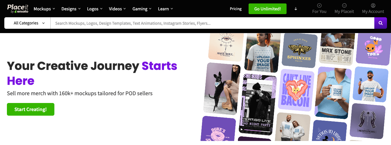
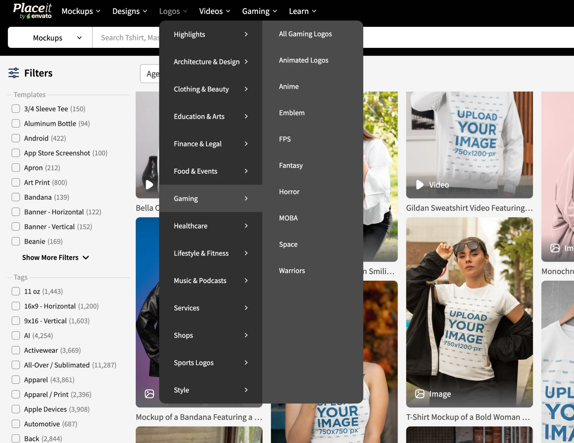
Placeit's navigation had grown into something like 51 mockup categories, 43 design categories, 78 logo categories, and 22 video categories, 194 in total, organized the way the CMS happened to store things, not the way anyone actually thought about what they needed.
What I found.
Card sorting and tree testing are two ends of the same question, and I needed both, not just one. Card sorting comes first: you hand people a stack of labels, the real category and subcategory names, and ask them to group the ones that belong together and name each group themselves. No page, no visual design, just how they'd organize it in their own heads. That gave me a rough shape for a new structure, built from actual mental models instead of the taxonomy the CMS had accumulated over the years.
Tree testing comes after, and it asks a different question: given a structure, can someone actually find a specific thing inside it? You strip the candidate structure down to plain text labels, no visual design at all, and give people a task. This wasn't a single pass either. Card sort, tree test, adjust, and repeat until the structure held up. Both agreed on the same underlying problem: the CMS's folder logic and the user's mental model had drifted apart over time.
The bet.
- The result
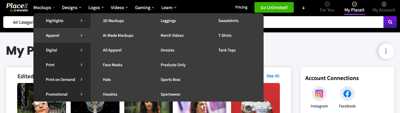
I rebuilt the menu around what the research showed instead of the existing taxonomy. The final version grouped everything under a handful of parent categories, Highlights, Apparel, Digital, Print, Print on Demand, Promotional, and each one expanded into a full wall of specific subcategories, all visible in a single hover instead of buried behind two or three clicks. The goal was specific on both ends: get people into categories that had been sitting invisible for years without pulling traffic away from the core lineup.
The result.
There was a prior measurement of visits per category, and after launch we compared traffic per category. The less visible categories got more clicks, and the main categories kept priority positions to protect their traffic. The structure was essentially solved at launch and only needed minor adjustments afterwards.
- 01Run a card sort with real users before touching your information architecture.
- 02Validate a new structure with tree testing before writing a line of code.
- 03Let the research do the heavy lifting so launch only needs minor adjustments.
 Placeit